
A Toggle Button looks simple, but it quietly controls many digital actions we use every day. You tap one to turn dark mode on, silence notifications, enable Wi-Fi, switch privacy settings, or activate a feature inside an app. It is small, visual, and fast, which is why designers use it across apps, websites, dashboards, and smart devices.
But there is a right way and a wrong way to use this control. When it is clear, it makes a product feel effortless. When it is confusing, users hesitate, click the wrong option, or wonder whether their choice was saved.
What Is a Toggle Button?
A Toggle Button is a user interface control that lets someone switch between two states, usually on and off. It works like a digital version of a physical light switch.
The idea is simple. One side means active. The other side means inactive. Users should understand the current state immediately without needing extra explanation.
Nielsen Norman Group describes toggle switches as controls for two mutually exclusive choices that should usually create an immediate result. That means when someone turns a setting on or off, the change should happen right away, not after several extra steps.
You see this pattern everywhere:
- Turning dark mode on or off
- Enabling push notifications
- Switching airplane mode
- Activating location access
- Turning smart lights on
- Muting a microphone
- Allowing cookies or privacy settings
- Switching between public and private profile settings
The main reason this control works so well is speed. A user sees the choice, understands it, and acts in one tap.
Why Toggle Buttons Are So Common Today
Digital products have become more personal. People want control over how apps behave, what data is shared, how devices respond, and what features stay active.
That is where the Toggle Button became useful. It gives users quick control without forcing them through long forms or confusing menus.
A checkbox can also show selection, but a toggle feels more immediate. It tells the user, “This setting is now active” or “This setting is now off.”
This matters especially on mobile screens, where space is limited. A compact switch can communicate a full setting without taking much room.
For example, compare these two options:
“Receive email updates” with a checkbox.
“Email updates” with an on/off switch.
The second version feels faster. It also fits naturally inside a settings screen.
Toggle Button Uses in Mobile Apps
Mobile apps depend heavily on simple interaction. Users do not want to read long instructions just to change a setting. They expect controls to behave naturally.
That is why app settings often use toggle controls for features like:
- Notifications
- Dark mode
- Auto-play videos
- Face ID or fingerprint login
- Privacy permissions
- Data saver mode
- Background refresh
- Sound effects
- Location sharing
A Toggle Button works well in mobile apps because it is touch-friendly and easy to scan. Users can move through a settings page and quickly see which features are active.
Think about a food delivery app. It might use a switch for “Allow order updates.” When the user turns it on, they expect delivery alerts to start working immediately.
A fitness app might use one for “Share activity with friends.” If it is on, the user understands their activity may be visible. If it is off, they expect more privacy.
The key is clarity. A toggle should never make users guess what will happen.
Toggle Buttons in Website Design
Websites also use toggle controls, especially when they offer interactive settings or user preferences.
You may find them in:
- Pricing pages
- Subscription settings
- Cookie preference panels
- Account dashboards
- Theme controls
- Search filters
- Accessibility settings
- Newsletter preferences
One common website example is the monthly vs yearly billing switch. Many software websites use a toggle to let visitors compare subscription pricing.
This works because the action is visual. The user switches between two pricing views and sees the result instantly.
Another example is a dark mode switch on a blog or news website. A reader can change the viewing experience without leaving the page.
A Toggle Button is also useful in admin dashboards. Website owners, editors, and managers can enable or disable features quickly.
For example:
- Show product on homepage
- Enable comments
- Publish profile publicly
- Turn maintenance mode on
- Activate two-factor authentication
When used correctly, toggles make websites feel responsive and modern.
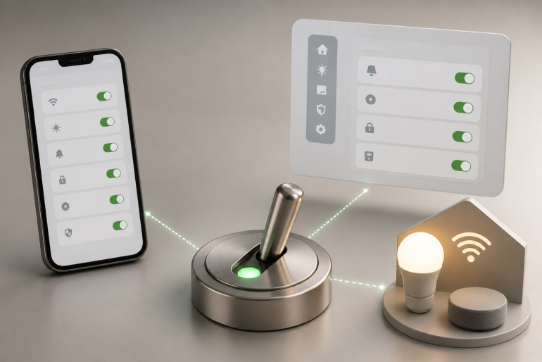
Toggle Buttons in Smart Devices
Smart devices may be where toggle controls feel most natural. Since many smart devices replace physical switches, the digital switch is easy for users to understand.
Smart home apps use toggle controls for:
- Lights
- Fans
- Security cameras
- Door locks
- Thermostats
- Smart plugs
- Speakers
- Robot vacuums
- Motion sensors
Imagine opening a smart home app and seeing “Living Room Light.” A switch beside it tells you immediately whether the light is on or off.
That simple visual state matters. Smart devices often control real-world actions, so users need confidence before tapping anything.
A smart lock is a good example. The control should clearly show whether the door is locked or unlocked. A vague switch could create real anxiety.
The same applies to security cameras. If recording is off, the user needs to know. If recording is on, the interface should make that clear without confusion.
Toggle Button vs Checkbox
Many people confuse a toggle with a checkbox because both can represent selected or unselected states. But they are not always interchangeable.
Here is a simple comparison:
| Feature | Toggle Button | Checkbox |
|---|---|---|
| Best for | On/off settings | Selecting one or more options |
| Action timing | Usually immediate | Often saved later |
| Common use | Settings, device controls | Forms, lists, preferences |
| Visual meaning | Active or inactive | Selected or not selected |
| User expectation | Change happens now | Choice may need submission |
A checkbox is better when the user is filling out a form and will click “Submit” or “Save” later.
A toggle is better when the user expects the setting to change immediately.
For example, “I agree to the terms” should usually be a checkbox, not a toggle. It is a confirmation, not an on/off system state.
But “Turn on email alerts” can work well as a toggle because the setting is either active or inactive.
When a Toggle Button Should Be Used
A toggle works best when the choice is simple, binary, and immediate.
Use it when:
- There are only two possible states
- The action can be understood quickly
- The result happens right away
- The setting can be reversed easily
- The user needs to see current status
- The label is short and clear
A good example is “Enable notifications.” It has two clear states. On means notifications are active. Off means they are not.
Another good example is “Private account.” The user can instantly understand whether the profile is private.
Material Design also presents switches as selection controls used to turn an option on or off, which fits common app and web interface patterns.
When Not to Use a Toggle Button
A toggle is not always the best choice. Sometimes it can confuse users or create accidental changes.
Avoid using it when:
- The action is dangerous
- The result is permanent
- The user needs to review details first
- More than two choices are available
- The setting requires a save button
- The label is unclear
- The user may not understand the consequence
For example, “Delete account” should not be a toggle. That action is serious and should require confirmation.
“Choose shipping method” should not be a toggle either because there may be more than two options.
A Toggle Button should feel safe and reversible. If the user taps it by mistake, they should be able to change it back without stress.
Real-World Scenario: Notification Settings
Let’s say a shopping app allows customers to manage alerts.
The app may show:
- Order updates
- Discount alerts
- New arrival notifications
- Price drop alerts
- Delivery reminders
Each option can have its own switch. This gives users control without forcing them to open multiple pages.
This is a strong use case because each setting is independent. A customer may want delivery reminders but not promotional alerts.
The interface feels respectful because it gives choice. It also reduces frustration, especially for users who dislike unnecessary notifications.
Real-World Scenario: Privacy Controls
Privacy settings are another major use case.
A social app might include:
- Show online status
- Allow friend requests
- Make profile private
- Share activity status
- Allow search engines to index profile
A toggle makes each privacy choice visible.
But privacy toggles need careful wording. A vague label like “Visibility” is not enough. A better label would be “Show my profile in search results.”
The user should know exactly what changes when the switch moves.
Privacy controls also need accessible design. Color alone should not be the only indicator. Text, position, and clear labels should support the visual state.
Real-World Scenario: Smart Home Controls
A smart home app might show a room list with switches beside each device.
Kitchen light: On
Bedroom fan: Off
Front camera: On
Porch light: Off
This layout helps users manage devices fast.
However, smart home toggles should update in real time. If a user turns off a light, the app should show the new state quickly.
If the device is offline, the interface should not pretend everything worked. It should display a message like “Device not reachable.”
This small detail builds trust.
Design Tips for Better Toggle Buttons
Good toggle design is not just about shape. It is about meaning.
Use Clear Labels
The label should describe the setting, not the action.
Better: “Email notifications”
Weak: “Turn this on”
Better: “Dark mode”
Weak: “Change theme”
Users scan settings quickly. A clear label saves time.
Show the Current State Clearly
The user should know whether the setting is active just by looking at it.
Use position, contrast, and words like “On” or “Off” when needed.
Do not depend only on color. Some users may have color vision differences, and others may use the app in poor lighting.
Make the Result Immediate
A toggle should usually work instantly. If the user must press a save button later, a checkbox may be a better choice.
This is one of the most important usability rules. If the control looks like a switch, users expect it to behave like one.
Avoid Risky Toggles
Do not use toggles for destructive actions.
For sensitive settings, add confirmation or extra explanation. For example, turning off two-factor authentication may need a warning because it affects account security.
Keep Wording Positive
Positive labels are easier to understand.
Better: “Enable location sharing”
Confusing: “Disable location blocking”
Negative wording makes users pause. In settings pages, hesitation can lead to mistakes.
Accessibility Matters More Than People Think
A Toggle Button should work for everyone, not only mouse or touch users.
That means it should be usable with a keyboard, readable by screen readers, and large enough to tap comfortably.
W3C develops web standards and accessibility guidance for building a web that works for more people, including users with different devices and abilities.
For better accessibility, designers and developers should consider:
- Clear text labels
- Keyboard focus states
- Screen reader support
- Enough contrast
- Touch-friendly size
- Visible on/off state
- Helpful error messages
Accessibility is not just a technical extra. It improves the experience for everyone.
A larger tap area helps users on small phones. Clear wording helps rushed users. Strong contrast helps people outdoors in sunlight.
Common Toggle Button Mistakes
Even experienced designers sometimes misuse toggle controls.
Mistake 1: Unclear Labels
A switch labeled “Active” can be confusing. What is active? The account? The feature? The subscription?
Use complete labels whenever possible.
Mistake 2: No Feedback
If the switch moves but nothing seems to happen, users may think the app is broken.
Give instant visual feedback. If a change needs time, show loading or status text.
Mistake 3: Using Toggles in Long Forms
If a user fills out a long form and clicks save at the end, toggles may feel misleading. The user might assume each change was already applied.
In forms, checkboxes are often safer.
Mistake 4: Color-Only Meaning
Green for on and gray for off may seem obvious, but not for everyone.
Add text, icons, or position differences to support meaning.
Mistake 5: Reversing Expected Direction
In many interfaces, right means on and left means off. Reversing that pattern can confuse users.
Consistency matters because people bring habits from other apps.
Toggle Button in UI and UX Design
In UI design, the control affects how the interface looks. In UX design, it affects how the user feels while using the product.
A beautiful switch is not enough. It must also be understandable.
The best toggle controls answer three questions instantly:
What setting is this?
Is it on or off?
What happens if I tap it?
If the user cannot answer these questions, the design needs improvement.
A Toggle Button should reduce thinking, not add more of it.
Toggle Buttons and User Trust
Small interface details can affect trust. When a user changes a setting, they expect the system to respect that choice.
If they turn off marketing emails and still receive them, trust drops.
If they disable location tracking but the app keeps asking for location in confusing ways, trust drops again.
The control is small, but the promise behind it is big. It tells the user, “You are in control.”
That is why toggles should be honest, accurate, and connected to real behavior.
How Developers Should Handle Toggle States
For developers, the visual control is only one part of the job. The state must be stored, updated, and communicated correctly.
A toggle may need to connect with:
- User account settings
- Local device storage
- App permissions
- API calls
- Database values
- Real-time device status
- Error handling
For example, if a user turns on “Two-factor authentication,” the app should not simply move the switch. It may need to verify identity, send a code, and confirm setup.
In that case, a simple toggle alone may not be enough. The interface might need a button that starts a setup process instead.
This is where product thinking matters. Not every on/off idea belongs inside a switch.
Toggle Button Examples by Industry
Different industries use this control in different ways.
Banking and Finance
Banking apps may use toggles for card controls, transaction alerts, biometric login, and spending notifications.
These settings affect security, so the interface must be clear and reliable.
Healthcare Apps
Health apps may use toggles for medication reminders, appointment alerts, data sharing, and health tracking.
Because health data is sensitive, users need clear language and privacy reassurance.
E-Commerce
Online stores use switches for stock alerts, order updates, wishlist notifications, and personalized recommendations.
This helps customers control communication without leaving the shopping flow.
Education Platforms
Learning apps may use toggles for lesson reminders, progress sharing, captions, autoplay, or quiz hints.
Simple switches help students personalize their study experience.
Gaming
Games often use toggles for sound, vibration, subtitles, difficulty assists, chat filters, and performance mode.
These settings directly affect comfort and play style.
Should Toggle Buttons Have Text Inside?
Sometimes yes, but not always.
On small mobile screens, text inside the switch may become hard to read. In that case, a clear label beside the switch is better.
For important settings, adding “On” and “Off” can help. This is especially useful for accessibility, admin tools, and business dashboards.
The goal is not decoration. The goal is certainty.
What Makes a Toggle Button Feel Modern?
Modern toggles usually share a few traits:
- Smooth movement
- Clear contrast
- Rounded shape
- Simple label
- Instant response
- Consistent placement
- Mobile-friendly spacing
But modern design should never sacrifice clarity.
A fancy animated switch that confuses users is worse than a plain one that works.
The best interface control is often the one users barely notice because it behaves exactly as expected.
FAQ About Toggle Buttons
What is a Toggle Button used for?
A Toggle Button is used to switch a setting between two states, usually on and off. It is common in apps, websites, dashboards, and smart devices.
Is a toggle better than a checkbox?
A toggle is better for immediate on/off settings. A checkbox is better for forms, agreements, or choices that are saved later.
Can toggles be used for privacy settings?
Yes, but the wording must be very clear. Privacy settings should explain exactly what is being turned on or off.
Should a toggle change instantly?
In most cases, yes. Users expect a toggle to apply the change immediately.
Are toggle controls good for mobile apps?
Yes. They are compact, touch-friendly, and easy to scan, which makes them useful for mobile settings screens.
Conclusion
A Toggle Button may look like a tiny design element, but it plays a big role in how people use digital products. It gives users control over settings, features, privacy, notifications, smart devices, and personal preferences.
The best toggles are simple, clear, and honest. They show the current state, use understandable labels, and apply changes immediately when appropriate. They also respect accessibility, because every user deserves a control they can understand and operate.
For apps, websites, and smart devices, this small switch can make the entire experience feel smoother. When designers and developers follow strong usability principles and trusted web standards, the result is a better interface that feels natural instead of confusing.