
If you have ever tried on a color that somehow made your skin look smoother, your eyes look softer, and your whole face seem more awake, you have already experienced the power of the Soft Autumn Color Palette. Some shades do a lot of work for you without asking for attention. Others can feel a little too stark, too icy, or too loud, even if they are beautiful on their own.
That is exactly why seasonal color analysis still matters. The point is not to limit your style. It is to help you understand which colors naturally echo your features so getting dressed feels easier and more flattering. Seasonal color analysis groups personal coloring by undertone, value, and chroma, and autumn palettes are generally associated with warmth, while “soft” points to muted, low-contrast coloring rather than bright, crisp intensity.
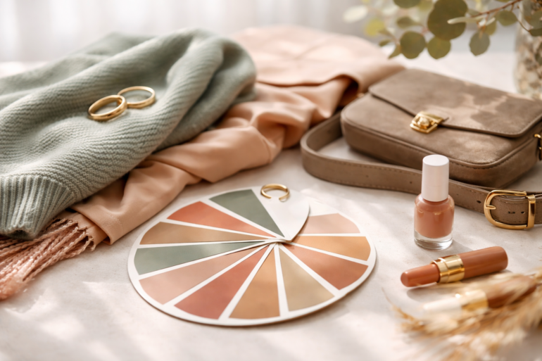
The Soft Autumn Color Palette is usually best on people who look harmonious in warm, muted, blended colors. Think gentle olive, moss, dusty teal, muted peach, warm taupe, soft camel, and earthy rose. These shades do not shout. They blend. And that softness is what makes them work so beautifully.
If you have been wondering why pure black feels too harsh, why icy pastels wash you out, or why warm dusty neutrals look far better than bright jewel tones, there is a good chance Soft Autumn colors are closer to your natural coloring. In this article, you will learn what defines this palette, how to recognize it in real life, and which clothing, makeup, and accessory colors tend to look the most flattering.
What Is the Soft Autumn Color Palette?
The Soft Autumn Color Palette sits on the warm and muted side of seasonal color analysis. In plain language, that means the colors are not extremely bright, sharp, or high contrast. Instead, they feel softened, earthy, and slightly toned down, like nature in early fall when everything looks warm but gently faded.
This palette is usually described by three core traits:
- Warm undertone
- Muted or softened coloring
- Low to medium contrast between skin, hair, and eyes
That balance matters. Seasonal systems generally compare warmth versus coolness and brightness versus softness when placing someone into a palette. In broader seasonal analysis, autumn families are warm, while soft variations are more muted than vivid.
A person who suits Soft Autumn often has features that blend rather than contrast sharply. Their coloring may look understated in the best way. Nothing feels too severe. Hair, skin, and eye color tend to sit in gentle harmony rather than strong opposition.
How Soft Autumn Usually Looks in Real Life
There is no single face of Soft Autumn, and that is important to say upfront. Seasonal color analysis is about how colors interact with your overall coloring, not about putting everyone into one narrow visual box.
Still, many Soft Autumn people share a few common patterns. Skin may read warm or neutral-warm. Hair may be soft brown, golden brown, dark blonde, light chestnut, or muted auburn. Eyes are often hazel, soft green, warm brown, gray-green, or muted blue with a softened appearance rather than a bright icy sparkle.
Undertone also matters. Beauty and makeup professionals commonly distinguish undertones as warm, cool, or neutral, and warm undertones are often complemented by shades like bronze, copper, and warm gold rather than icy silver tones.
A helpful clue is contrast. If your features look more blended than dramatic, and you tend to look better in quiet earthy shades than in neon, stark white, or true black, that often points toward a softer palette.
Why These Colors Look So Flattering
The reason the Soft Autumn Color Palette works is fairly simple. Colors look most flattering when their warmth, softness, and depth echo your natural coloring instead of fighting against it. When that happens, your face appears more balanced. Skin tends to look more even, shadows can seem less obvious, and your features come forward before the outfit does.
Color theory helps explain this. Hue, saturation, and luminance all affect how a color feels visually, and muted shades create a gentler impression than highly saturated ones. In both art and design, the relationship between neighboring colors influences harmony, contrast, and the mood of a palette.
That is why bright fuchsia, optic white, or sharp black can feel separate from a Soft Autumn face. They are not always “wrong” in an absolute sense, but they often wear the person instead of the person wearing them.
The Best Clothing Colors in a Soft Autumn Color Palette
When you are building around the Soft Autumn Color Palette, the goal is warmth with softness. You want colors that feel sun-washed, earthy, and calm.
Here are the shades that usually work beautifully:
Soft neutrals
These are the backbone of a Soft Autumn wardrobe because they make outfit building incredibly easy.
- Warm taupe
- Mushroom
- Oatmeal
- Camel
- Soft chocolate
- Latte
- Warm gray
- Olive brown
- Cream instead of stark white
These neutrals feel polished without looking cold. They also pair well with almost every accent shade in the palette.
Greens that tend to flatter
Soft Autumn greens usually look natural and expensive.
- Moss
- Sage
- Soft olive
- Eucalyptus
- Khaki green
These shades often make eyes stand out without creating harsh contrast.
Blues with warmth and softness
This is where many people get surprised. Soft Autumn can wear blue, just not the icy or electric versions.
- Dusty teal
- Muted turquoise
- Soft petrol
- Gray-blue with warmth
- Warm navy
These tones feel far more harmonious than cobalt or bright royal blue.
Earthy oranges and reds
Autumn palettes usually shine here, but the Soft Autumn version stays quiet rather than fiery.
- Terracotta
- Cinnamon
- Rust softened with brown
- Salmon
- Muted coral
- Brick rose
- Warm dusty peach
These colors can bring life into the face without overwhelming it.
Best pinks and purples
Soft Autumn does not usually thrive in sugary cool pinks, but warmer muted versions can be gorgeous.
- Dusty rose
- Peachy pink
- Warm mauve
- Muted plum
- Rose brown
These are especially wearable in blouses, knitwear, lipstick, and scarves.
A Simple Table to Understand the Palette Better
| Color Family | Best Soft Autumn Version | Usually Less Flattering |
|---|---|---|
| White | Cream, ivory, soft ecru | Pure optic white |
| Black | Soft chocolate, deep olive, warm charcoal | True jet black |
| Blue | Dusty teal, muted turquoise, warm navy | Icy blue, cobalt |
| Green | Sage, moss, olive | Neon green, cool emerald |
| Pink | Dusty rose, peach pink | Bubblegum pink, icy pink |
| Red | Brick, terracotta, muted coral | Blue-red, cherry red |
| Brown | Camel, cocoa, mushroom, chestnut | Ashy gray-brown |
| Purple | Warm mauve, muted plum | Bright violet |
This is where many people get instant clarity. It is often not that a whole color family is bad on you. It is the version of that color that matters.
Colors That Usually Clash with Soft Autumn
Knowing what to avoid can save just as much time as knowing what to buy.
The shades that often compete with the Soft Autumn Color Palette include:
- Jet black
- Pure white
- Neon shades
- Icy pastels
- Sharp jewel tones
- Very cool grays
- Electric blue
- Magenta
- Blue-based reds
These colors can create too much contrast or pull your complexion in a cooler direction than your natural coloring supports.
That does not mean you can never wear them. It simply means they usually work better when softened. A bright color in a print, a handbag, or shoes may feel much easier to wear than a full sweater in that shade.
How to Tell if You Are Really Soft Autumn
This is where honesty helps. Plenty of people like autumn colors, but not everyone is a Soft Autumn.
You may be Soft Autumn if:
- Warm muted colors make your skin look calmer and smoother
- Pure black feels harsh on your face
- Cream looks better than bright white
- Gold tends to look more natural than icy silver
- Muted olive, taupe, and dusty teal feel surprisingly flattering
- Bright high-contrast prints wear you out visually
You may not be Soft Autumn if:
- Cool pinks and icy shades make you glow
- You look amazing in stark black and white
- Bright jewel tones make your features pop in a good way
- Very clear, crisp colors suit you better than softened earthy ones
A useful test is to drape fabrics near your face in natural daylight. Soft Autumn colors usually make the skin look more even and the eyes more connected to the face. Wrong colors often show up fast. You may notice redness, under-eye shadows, dullness, or a sense that your features disappear.
Building a Soft Autumn Wardrobe Without Starting Over
One of the biggest mistakes people make is thinking they need to throw everything out. You do not. A smarter approach is to edit gradually.
Start with the pieces you wear closest to your face. Tops, scarves, jackets, coats, sweaters, and earrings make the biggest difference because they sit right next to your skin. If those items flatter you, the entire outfit tends to work better.
A practical Soft Autumn wardrobe often starts like this:
- 3 to 5 flattering neutrals
- 2 to 3 accent colors you genuinely love
- 1 signature metal tone, usually soft gold, antique gold, bronze, or mixed warm metals
- A reliable lipstick and blush family that match the palette
This makes shopping much easier because you stop buying random colors that never quite work with the rest of your closet.
Best Makeup Shades for Soft Autumn
Makeup usually looks best when it follows the same logic as the Soft Autumn Color Palette. Think soft definition, warmth, and muted depth.
Foundation and base
Undertone matters first. Many beauty brands sort complexion products by warm, cool, or neutral undertones, and choosing the right undertone is usually more important than chasing the perfect name on the bottle.
Blush
Good blush shades often include:
- Apricot
- Warm rose
- Peach
- Soft terracotta
Lip colors
Lipstick tends to look best in:
- Rose brown
- Peach nude
- Cinnamon nude
- Warm mauve
- Soft brick
Eyeshadow
Soft Autumn eye makeup usually shines in:
- Bronze
- Olive
- Taupe
- Cocoa
- Soft plum
- Warm beige
Very frosty finishes can feel too cool, while earthy satin and soft matte textures usually look more natural.
Jewelry, Accessories, and Prints
The right accessories can bring the whole palette together.
Soft Autumn often looks especially good in:
- Antique gold
- Soft gold
- Bronze
- Brushed metal finishes
- Tortoiseshell
- Warm leather in tan, chestnut, or olive-brown
Prints also matter. Soft Autumn people are often flattered by blended, low-contrast prints rather than graphic black-and-white patterns. Think watercolor florals, muted checks, soft animal prints, or tonal stripes.
If your wardrobe leans minimal, this is actually good news. The Soft Autumn Color Palette looks elegant in simple shapes because the color harmony does a lot of the work.
Seasonal Dressing with a Soft Autumn Color Palette
This palette works all year, not just in fall.
Spring
Lean into sage, warm beige, soft peach, and eucalyptus. These shades feel fresh without becoming sugary or cool.
Summer
Try muted turquoise, dusty teal, sand, olive, and warm cream. Summer clothes often become too bright, so this is the season where staying muted makes the biggest difference.
Autumn
This is naturally your strongest season. Terracotta, moss, cinnamon, camel, and cocoa tend to look incredibly at home.
Winter
Swap stark winter colors for deeper warm alternatives. Instead of black, use espresso, deep olive, warm charcoal, or dark chocolate. Instead of icy red, choose brick or softened berry.
Common Mistakes People Make with Soft Autumn
There are a few patterns that show up again and again.
The first is wearing colors that are warm but too bright. A strong orange or vivid mustard might technically be warm, but still too intense for Soft Autumn. The softness matters just as much as the warmth.
The second is copying a generic autumn palette without noticing that Soft Autumn is lighter, gentler, and more muted than deeper autumn categories. If something feels too rich or dramatic, it may belong to another autumn subgroup.
The third is focusing only on clothes and ignoring makeup, hair color, and accessories. When all of those elements support the same palette, the effect is much more polished.
Real-World Styling Example
Imagine two blouses on the same person. One is pure white. The other is soft cream. The pure white may make the skin look redder and the under-eye area slightly more obvious. The cream blouse, on the other hand, can make the complexion look warmer and more even.
Now compare bright cobalt with dusty teal. Cobalt may arrive before your face does. Dusty teal lets your features stay present. That is the difference people feel when they say a color looks “more flattering,” even if they cannot explain why.
This is why the Soft Autumn Color Palette is so useful in practice. It turns vague styling frustration into something specific you can actually use.
Final Thoughts
The Soft Autumn Color Palette is less about strict rules and more about visual harmony. When your colors match your natural softness and warmth, your appearance tends to look balanced, refined, and effortless. Clothes stop competing with your face. Makeup starts looking integrated rather than obvious. Shopping becomes more focused, and getting dressed becomes easier.
If you are drawn to earthy elegance, soft contrast, warm muted tones, and a wardrobe that feels calm instead of loud, there is a good chance this palette is speaking your language for a reason. The most flattering colors are often the ones that let people notice you first and the outfit second.
And if you want to understand the broader idea behind seasonal color analysis, it helps explain why palettes like Soft Autumn remain so useful in fashion, beauty, and personal styling.
A well-used Soft Autumn Color Palette does not make your style smaller. It makes it smarter. Once you know your best shades, you can still wear trends, experiment with makeup, and build a wardrobe that feels personal. You are simply doing it with colors that naturally support your features instead of fighting them.