

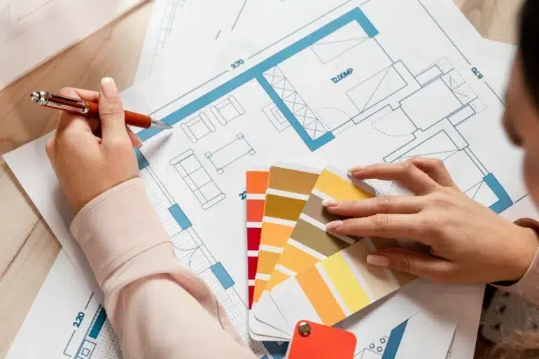
Okay, quick confession before we get into this. Early in my career I painted an entire bedroom in a deep, moody blue because it looked stunning on Pinterest. Client hated sleeping in it within a week. Too “closed in,” she said. Lesson learned the hard way, colour isn’t just about what looks good in a photo, it’s about how a room actually makes you feel at 11pm on a Tuesday.
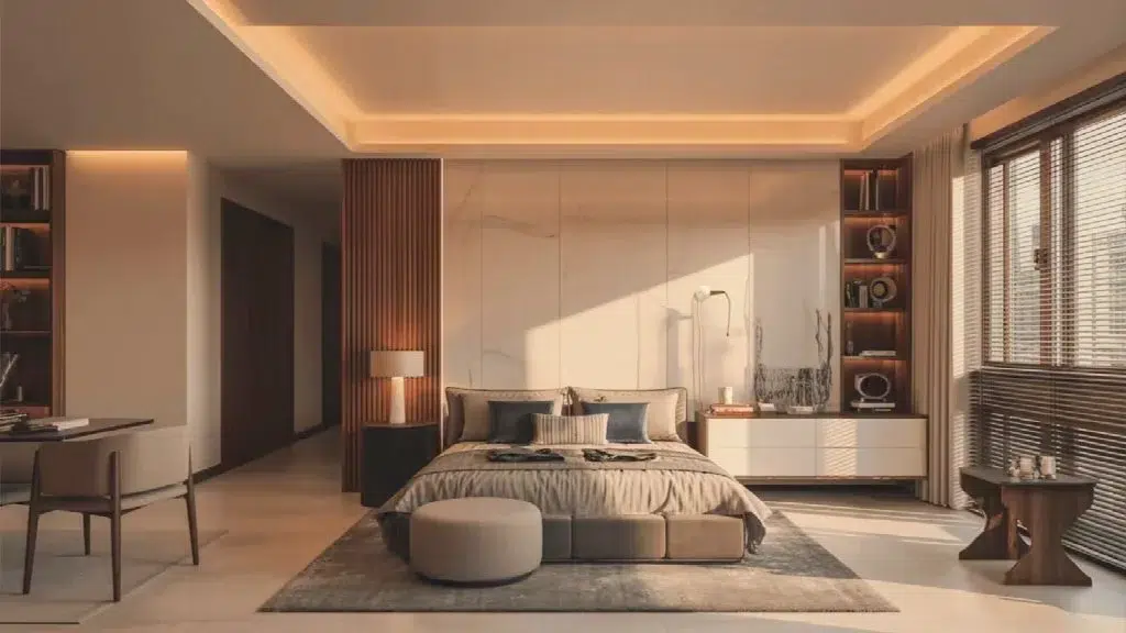
That’s really the whole idea behind color psychology, and it’s something any good interior decorator in Gurgaon should be thinking about long before swatches come out.
Why Colour Isn’t Just Decoration
Colour psychology is the study of how different hues affect mood, behaviour, even appetite and sleep quality. Blues tend to calm. Reds stimulate energy and appetite, which is why so many restaurants use them. Greens are easy on tired eyes. Warm neutrals, the beiges, sands, and clay tones, tend to make a space feel welcoming rather than sterile.
For interior designer gurugram clients, this matters because Indian homes often serve multiple functions in a single day. A living room that hosts a puja in the morning, a work call by noon, and a family dinner by night needs a colour scheme that doesn’t work against any of those moods.
Living Rooms: Warm, Not Loud
A trend we’re seeing more of in 2026 is moving away from stark all white or all grey living rooms. They photograph well, but can feel cold to live in day to day. A combination that’s worked well is three walls in a warm beige or sand tone, with one accent wall in something deeper, an olive or muted terracotta. Warm tones make a space feel welcoming, which matters when your living room is where guests get their first impression of your home.
Bedrooms: Where Colour Choices Actually Affect Sleep
Bedrooms are not the place for bold, saturated colour. Bright reds, intense oranges, high saturation purples are stimulating, and stimulating is the last thing you want in a room whose job is to help you wind down. Sleep quality genuinely dips in rooms painted with these tones.
Softer, muted tones, dusty blues, sage greens, warm greys, tend to work far better. As interior decorator in gurgaon professionals, we’ll often push back gently when a client wants a dramatic bedroom colour, because we’ve seen how it plays out six months later.
Kitchens and the Appetite Connection
Reds and warm oranges do have their place though, kitchens and dining spaces being the obvious one. There’s a reason so many restaurants lean into warm, saturated palettes, it stimulates appetite and creates a lively, social energy. A muted terracotta backsplash or a warm accent in the dining nook does a lot of quiet psychological work.
The Indian Context: Festivals, Family, and Flexibility
Designing for Indian homes is different because a space needs to flex. A living room needs to feel calm on a regular Tuesday but also hold up during Diwali or a big family gathering. This is where interior designer in gurugram clients benefit from a layered approach, a neutral, warm base palette dressed up seasonally with cushions, drapes, and accent pieces.
At Native Sutra, this layered thinking is baked into how we approach colour consultations. We start with the base palette conversation early, tied to how the family uses the space, and treat accent colour as the flexible layer on top.
A Few Rules of Thumb Worth Remembering
Test any colour in the actual room, at different times of day, before committing, Gurgaon’s harsh afternoon light can wash out a colour that looked rich in the store. Avoid high saturation colours in bedrooms and spaces meant for rest. Warm neutrals age better than trend driven colours.
It’s Not Just Paint, Either
Colour psychology doesn’t stop at wall paint. Furniture upholstery, curtain fabric, even your kitchen cabinet finish carry the same psychological weight. A matte, muted material reads as calm and grounded, while high gloss, saturated finishes read as energetic.
Wrapping This Up
Good colour choices aren’t really about following whatever’s trending this year. They’re about understanding how a family actually lives in a space and choosing tones that support that rhythm.
If you’re planning a colour refresh or a full home design and want someone who thinks through this properly, Native Sutra’s design team approaches every colour decision with exactly this kind of psychology in mind.
Frequently Asked Questions
Q1. What’s the best colour for an Indian living room in 2026?
Warm neutrals like beige and sand, paired with one deeper accent wall in olive or terracotta, work well and keep the space warm without feeling dated.
Q2. Should I avoid bright colours in my bedroom completely?
Not entirely, but keep bold, saturated tones like bright red or orange out of the bedroom. Softer, muted versions in accents or textiles are usually fine.
Q3. Do dark colours make a small room feel smaller?
Generally yes, especially in low light rooms. Lighter, warmer tones work better for making the space feel open.
Q4. How often should I repaint based on trends?
Not often. A good neutral base with flexible accents like cushions and drapes lets you update the look without repainting every couple of years.
Q5. Can Native Sutra help with just colour consultation, not a full renovation?
Yes, colour and material consultations are part of our broader interior design services, even for smaller scope projects.