
Roulette looks simple because the table is familiar: numbers, colours, chips, and a wheel. Online, though, the experience depends heavily on interface design. The layout decides what players notice first, how quickly they understand their choices, and whether they can find limits before placing a bet.
For a technology site like iTechSoul, roulette is not only a casino topic. It is also a user experience topic. A clear interface can slow decisions down. A confusing one can make a simple game feel rushed.
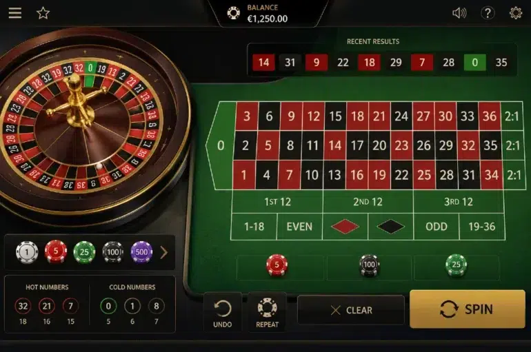
Good design starts with readable information
Online roulette pages need to explain the game without crowding the screen. Players should be able to see the betting area, stake options, account balance, help section, and game rules without searching through too many menus.
A roulette interface should make basic actions obvious. The player needs to know where to choose a chip value, where to place it, how to clear a selection, and where to read the rules. If those actions are hidden or visually cluttered, the design is working against the user.
Layout can reduce confusion
Roulette has several betting areas, and not every player understands them at first. Inside bets, outside bets, colour choices, odd or even selections, and number groups can sit close together on the screen. A good interface separates these areas clearly.
Small design choices matter here. Button spacing, font size, contrast, and labels all shape how easy the game feels. On mobile, this becomes even more important because the betting grid has to fit into a smaller space without making taps inaccurate.
The page for roulette online at Christchurch Casino focuses on roulette as part of an online casino experience for New Zealand players, giving a useful example of how a dedicated roulette page can introduce the game before users move into specific play options.
Speed controls the mood of the session
Digital products often reward speed. Fast loading pages, quick buttons, and instant feedback are usually good things. In gambling interfaces, speed needs more care.
If every action feels frictionless, players may make decisions faster than intended. That is why visible balance information, clear bet confirmation, and easy access to rules are useful. They create small pauses.
A better roulette interface does not need to be slow or awkward. It just needs to avoid pushing players into automatic behaviour. Good design helps users notice what they are doing.
Mobile design changes the experience
Many users browse casino pages on phones, so roulette interfaces have to work well on smaller screens. A desktop layout cannot simply be squeezed into a mobile frame. The table, chips, menu, and help features all need to remain readable.
Useful mobile design features include:
- Large touch targets;
- Clear chip value buttons;
- Easy access to game rules;
- Visible account balance;
- Simple navigation back to the lobby;
- Limit tools that are not buried in menus.
These details may seem basic, but they affect confidence. A player who can read the screen properly is less likely to make accidental choices.
Visual design should not hide risk
Roulette interfaces often use polished graphics, sound, and animation. That can make the game more engaging, but design should not turn risk into background noise. Balance changes, stake size, and limit tools should be as visible as the game visuals.
This is where responsible design matters. Entertainment can still be clear. A page can look modern without making cost, rules, or account controls hard to find.
Players should be careful with any interface that feels too busy to read calmly. If the design keeps pulling attention toward motion, colour, or urgent prompts, it becomes harder to make measured decisions.
Clear interfaces support better choices
A strong roulette interface does more than display a wheel and betting grid. It helps players understand the structure of the game before they act. It separates choices clearly, explains rules in plain language, keeps stake information visible, and gives account tools enough space.
For online roulette, design is not decoration. It is part of how the game is understood. A cleaner screen, better labels, and visible controls can make the difference between casual entertainment and rushed decision making.