
Walk into any executive review today and you’ll likely find the same picture. Five tabs open, three versions of the “same” revenue number, a finance deck built overnight, and someone in the corner quietly fixing a pivot table. The data exists. It just doesn’t help.
That gap between data that exists and data that drives action is the gap good Power BI solutions are built to close.
Why Executive Reporting Still Fails to Drive Fast Decisions
Most leadership teams aren’t short on tools. They’re short on a story.
Static PDFs land in inboxes a week after the period closes. Sales has one truth, finance has another, ops has a third. Board meetings turn into debates about whose number is right, not what to do about it. By the time everyone aligns, the market has already moved on.
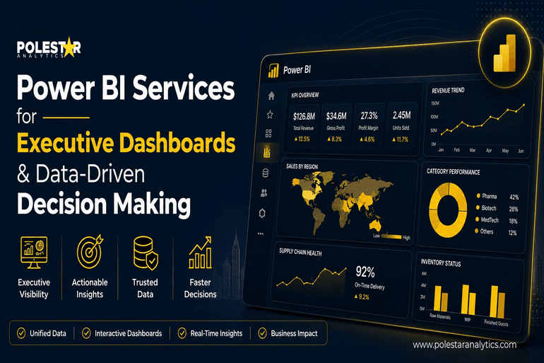
Power BI changes this not because it’s prettier, but because it’s connected. A well-built executive dashboard pulls from the ERP, the CRM, the planning tool, the warehouse — and presents one version that everyone trusts. The argument stops being about the data. It starts being about the decision.
That shift, small as it sounds, is where the real value lives.
Which Power BI Services Enable Better Executive Decision-Making?

If you’re a CXO evaluating where Power BI services actually move the needle, four areas matter more than the rest.
1. Data modelling and semantic layer design. This is the one that decides whether your dashboard is useful or just colourful. A clean semantic model built in Power BI or layered through Microsoft Fabric means every leader, from the CEO to a regional GM, sees the same definition of “net revenue” or “active customer.” Without it, you’re just rebuilding the same disagreements in a nicer interface.
2. Real-time and DirectQuery integration. For decisions that can’t wait, Power BI’s DirectQuery and push dataset capabilities pull live numbers from Azure SQL, Snowflake, Databricks, or Dynamics 365 the moment you open the report. Manufacturing line outages, cash position, fulfilment delays — all visible as they happen, not in next Monday’s slide pack.
3. Embedded AI and Copilot in Power BI. Natural-language queries (“show me Q3 margin by region, year over year”) and AI-generated narratives have changed how executives actually use these reports. You don’t need a DAX cheat sheet anymore. You ask a question; the dashboard answers. And with Copilot, summary commentary writes itself — which matters when ten people are about to ask the same “so what?” question.
4. Governance, Row-Level Security, and mobile delivery. The CFO and a regional director should be able to open the same dashboard and see different slices of data. Power BI’s Row-Level Security handles that natively. The mobile app handles the rest — because the most important decisions rarely happen at a desk.
Beyond these, the often-overlooked Power BI services — dataflows for centralised data prep, deployment pipelines for clean dev-to-prod releases, and Power BI Premium capacity for scale — are what separate a dashboard demo from a dashboard that survives three years of growth.
From KPI Tracking to Actionable Decisions: Where Power BI Stands Out
A KPI on its own is just a number. Revenue down 4%. Okay — and?
What executives need is the path from headline to action, in as few clicks as possible. Power BI is built for this. Click a regional dip, drill into the product mix, see that one SKU is dragging the segment, jump into the sales pipeline, find the deals slipping. Three clicks. No analyst call required.
This is what shifts the conversation in the room. Instead of “let’s investigate and report back next week,” it becomes “let’s reassign quota by Friday.” Speed compounds. So does trust.
The leaders getting the most out of Power BI aren’t the ones with the prettiest dashboards. They’re the ones whose dashboards changed how meetings run.
The Small Dashboard Decisions That Have a Big Executive Impact
Executives working across industries observe a few patterns that show up every now and then:
- Five to seven KPIs on the landing page. Not fifteen. Anything more and the eye stops processing.
- Direction matters more than the number. Show trend arrows, sparklines, and variance to plan. A static figure tells you where you are; a trend tells you where you’re going.
- Drill-through is non-negotiable. If a CEO can’t get from the headline to the root cause inside the report, they’ll ask an analyst — and you’re back to slow cycles.
- Mobile-first design isn’t optional. Most CXOs open Power BI between meetings, on a phone, with three minutes to spare. Build for that, not for the 27-inch monitor.
These aren’t technical choices. They’re design choices that decide whether the dashboard gets used or quietly abandoned.
The Future of Executive Dashboards and Decision Intelligence
Power BI isn’t standing still. With Microsoft Fabric stitching together data engineering, warehousing, and BI under one roof, and Copilot moving from “neat feature” to genuine decision partner, executive dashboards are heading toward something closer to a conversation than a report. You ask, it answers, it flags what you didn’t think to ask.
For leadership teams still relying on monthly PowerPoint packs, the gap to what’s now possible is wider than most realise. And it’s widening fast.
The companies that close that gap first won’t just have better reports. They’ll make better decisions faster, with more confidence, and with the whole leadership team actually looking at the same picture.
How Polestar Analytics Helps Build Executive-Ready Power BI Solutions
This is where having the right delivery partner matters. As a Microsoft Gold Partner with 250+ Microsoft-certified experts, Polestar Analytics builds executive dashboards that go beyond surface-level reporting. The Microsoft Analytics Studio brings together Power BI, Azure, Microsoft Fabric, and Copilot under one delivery model — so your dashboards aren’t just visually clean, they’re built on a data foundation that holds up at scale.
The results show up where they should. For one client, sales-visibility turnaround dropped by 98.95% after a Power BI rollout. For another, reporting TAT fell 95% after Azure Synapse modernisation. Real outcomes, not slideware.
Whether you’re migrating from legacy BI, scaling Power BI across business units, or layering AI on top of your existing reporting, Polestar Analytics‘ Power BI services are built around one question executives actually care about — is this changing how we decide?