
If you create content for the internet, you are not just writing for people with perfect vision, perfect hearing, a steady hand, and a quiet room. Real life is messier than that. Someone is reading your post in bright sunlight. Someone is using a screen reader. Someone is recovering from an injury. Someone has low vision and needs higher contrast. And many people simply get tired and start missing things when a page is cluttered.
That is why accessibility matters. And it is also why Bumpdots.com belongs in the conversation, even if you primarily think of it as a physical product site.
At first glance, tactile bump dots feel like a small, offline solution. But for content creators, they can be part of a bigger system: an accessibility minded workflow that helps you publish cleaner, more usable content, every time.
People with disabilities represent a huge audience. The World Health Organization estimates 1.3 billion people experience significant disability, about 16% of the world’s population. And the web still has a long way to go: WebAIM’s Million report found tens of millions of detectable accessibility errors across one million homepages, averaging about 51 errors per page in the 2025 report.
This guide will show you how to think about accessibility like a creator, how tactile tools from Bumpdots.com can support your process, and how to publish content that more people can actually use.
What is accessibility (and why creators should care)
Accessibility means designing and publishing content so people with disabilities can perceive it, understand it, navigate it, and interact with it.
A helpful way to ground this is the WCAG standard (Web Content Accessibility Guidelines) from W3C, which is the most widely referenced framework for web content accessibility. WCAG explains how to make web content more accessible to people with disabilities and more usable for everyone.
For creators, accessibility is not only a moral good. It is also practical:
- It improves user experience (fewer people bounce because they cannot read or use your page).
- It supports SEO indirectly because clear structure, descriptive text, and usable navigation help both humans and machines.
- It reduces friction for mobile users and people in difficult situations (noise, glare, slow internet).
Microsoft’s inclusive design approach is popular because it reminds us accessibility benefits people with permanent, temporary, and situational challenges.
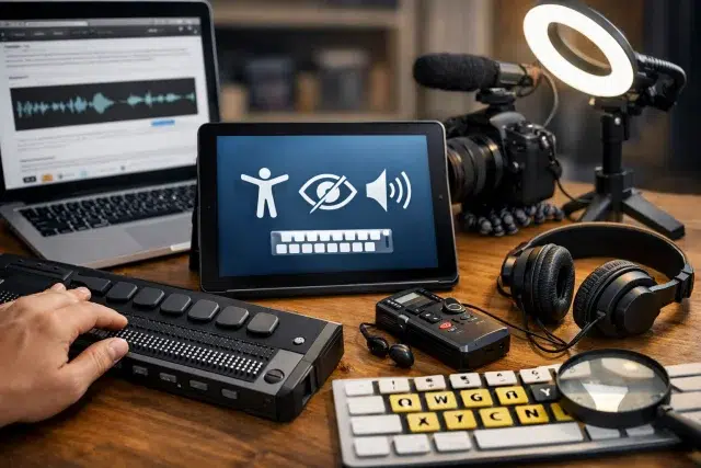
Where Bumpdots.com fits into a creator’s workflow
Let’s be specific. Bumpdots.com sells tactile bump dots used to mark and identify physical controls and objects by touch. That includes things like keyboard shortcuts, audio gear, camera buttons, power strips, notebook tabs, remote controls, or anything else you want to locate instantly without relying on sight.
So how does that connect to content creation?
Because content creation is not only writing. It is a workflow that includes:
- Editing and formatting
- Asset management (images, screenshots, files)
- Recording and publishing
- Repeating the same steps consistently
- Using tools, keyboards, mics, mixers, and devices for hours
If you can reduce tiny points of friction, you publish more consistently and with fewer mistakes. Tactile markers can help you:
- Find the right key or button without looking away from your screen
- Prevent accidental presses during recording
- Build repeatable routines (the same dot means the same action every time)
- Support creators with low vision, tremors, or motor fatigue
- Make your workspace accessible to collaborators or family members who use it too
In short, Bumpdots.com can support the “physical accessibility” side of creating content, while you also improve “digital accessibility” in what you publish.
The accessibility basics every content creator should master
You do not need to memorize every WCAG success criterion to make real progress. Start with the areas that cause the most common failures at scale.
WebAIM’s Million research repeatedly highlights issues like low contrast, missing alternative text, missing form labels, and empty links and buttons as common problems.
Here is a creator friendly checklist to build into your routine.
1) Headings that actually act like headings
Headings are not decoration. They are navigation.
Do this:
- Use one clear H1 for the page title.
- Use H2 for major sections, H3 for subsections.
- Keep headings descriptive, not vague.
Avoid:
- Jumping from H2 to H4 because it “looks smaller”
- Using headings for styling only
Practical example: Instead of “Tips,” use “Accessibility tips for images, video, and layout.”
2) Write like a human, but structure like a librarian
Readers love conversational writing. Screen readers love structure. You can do both.
A strong pattern:
- Short paragraphs (2–4 sentences)
- A clear lead sentence per section
- Bullets for lists, steps, and comparisons
- Consistent terminology (do not rename the same thing five different ways)
3) Alt text that helps, not alt text that fills space
Alt text should communicate meaning, not just describe pixels.
Good alt text answers:
- What is this image for?
- What should the reader learn from it?
Examples:
- Bad: “image of chart”
- Better: “Bar chart showing most common accessibility errors: low contrast and missing alt text”
If an image is decorative, use empty alt text so assistive tech can skip it.
4) Contrast and readable typography
Low contrast is a constant problem across the web.
Creator habits that help:
- Avoid light gray text on white backgrounds
- Do not rely on color alone to communicate meaning
- Use a comfortable font size and line height
- Keep line length reasonable (very long lines are tiring)
5) Links that make sense out of context
Screen reader users often browse links as a list. If your links say “click here” twenty times, that list becomes useless.
Try:
- “Download the accessibility checklist”
- “Read the WCAG overview from W3C”
6) Captions and transcripts for audio and video
If you publish video, captions are a big deal. They help:
- Deaf and hard of hearing users
- People in noisy places
- People learning a new language
- People who prefer reading
When possible, include a transcript too. It is also great for search and for readers who want to skim.
7) Keyboard friendly content
Many users navigate without a mouse, including people using assistive tech or those with motor limitations.
At minimum:
- Make sure menus and buttons are reachable with the Tab key
- Ensure focus states are visible
- Avoid interactive elements that trap focus
WCAG is built around testable guidance to help with these problems.
Bumpdots.com setup ideas for creators who want a more accessible workspace
This section is about real life. If your hands already know where the important controls are, you can focus on creating.
Here are practical ways creators often use tactile markers like the ones from Bumpdots.com.
Label your “high impact” controls first
Start small. Pick 5–10 controls you touch constantly:
- Record button on an audio interface
- Mute button on a mic
- Volume knob at a safe level
- Camera record button
- Power switch on a light
- The correct key on a macro pad
Make each dot mean something consistent.
A simple mapping example:
- One dot = record or start
- Two dots = stop
- Ridge dot = mute
- Large dot = emergency or power
The exact scheme is less important than consistency.
Use tactile cues to reduce mistakes during recording
If you have ever:
- Accidentally muted your mic mid sentence
- Hit stop instead of pause
- Knocked a dial out of position
- Turned off the wrong power strip
You already understand why tactile labeling helps.
A dot can make “I think this is the right button” become “I know this is the right button.”
Create a “no look” editing workflow
Some creators develop keyboard heavy workflows to reduce strain. Tactile cues can support that habit.
Ideas:
- Mark the F and J keys if your keyboard is worn down
- Mark key shortcuts you use for trimming, cutting, and playback
- Mark a macro key for “insert heading,” “bold,” or “add link” if your tool supports it
This is where Bumpdots.com becomes less about disability alone and more about speed and accuracy for everyone.
Digital accessibility meets physical accessibility: a quick comparison
Here is a simple way to think about the two sides, especially if you manage a content site.
| Area | What it affects | Common creator mistakes | Quick win |
|---|---|---|---|
| Digital accessibility | Readers using screen readers, keyboard navigation, low vision, cognitive load | Missing alt text, poor headings, low contrast, vague links | Add structure, improve contrast, write descriptive links |
| Physical accessibility | Creator workflow, recording accuracy, device navigation | Misclicks, wrong buttons, inconsistent setup | Tactile labeling with Bumpdots.com, consistent workspace layout |
| Situational accessibility | Everyone on bad days or messy environments | Tiny tap targets, unreadable layouts on mobile | Mobile first formatting, larger buttons, clean spacing |
Microsoft’s inclusive design framing makes this feel obvious once you see it: design for the edges, and more people benefit.
Accessibility and SEO: what is real, what is hype
Accessibility is not a magic SEO hack. But it often leads to the same things search engines reward:
- Clear structure and headings
- Descriptive text around media
- Faster understanding of page content
- Better engagement signals (people stay because they can use the page)
Also, the web is still full of accessibility problems at scale, so creators who do the basics well immediately stand out.
Think of accessibility as “reducing friction.” SEO is often a side effect of removing friction.
A practical publishing checklist you can use every time
Before you publish, run through this list. It is designed for speed.
Content structure
- One clear H1
- Logical H2 and H3 hierarchy
- Short paragraphs
- Lists for steps and comparisons
Media
- Every meaningful image has useful alt text
- Decorative images have empty alt text
- Video has captions (or at least a transcript)
Links and navigation
- Links are descriptive (no “click here” spam)
- Buttons and menus are keyboard accessible
- Focus indicators are visible
Readability
- Good contrast
- Clear font size and spacing
- Avoid walls of text
Creator workflow
- Your recording and editing controls are consistently labeled
- Your setup is repeatable and easy to use
- Physical tools from Bumpdots.com are placed where you actually need them
If you want to go deeper into WCAG concepts in a developer friendly way, MDN’s overview is a strong learning resource.
Common questions content creators ask about accessibility
Is accessibility only for people who are blind?
No. Accessibility covers a wide range of needs, including low vision, deafness or hard of hearing, motor disabilities, cognitive and learning differences, and more. And it also helps people in temporary or situational constraints.
Do I need to rebuild my whole website?
Usually not. Most creators get big results from basic fixes: headings, contrast, alt text, and keyboard friendly navigation.
How does Bumpdots.com help if it is a physical product?
Because creators use physical tools to publish digital content. If your workspace is easier to operate without errors, you produce more consistently and you can focus on making the published content accessible too.
What is the fastest accessibility win?
Fix structure and clarity first:
- Correct headings
- Descriptive links
- Better contrast
- Real alt text
Those changes improve the experience for almost everyone.
How do I know if my site has accessibility issues?
Use an automated checker to catch obvious problems, then do a human review:
- Navigate with only a keyboard
- Zoom text to 200% and see if the layout breaks
- Turn on a screen reader and try reading your headings and links
Automation finds patterns. Humans find real usability issues.
Real world scenario: a creator who publishes faster and cleaner
Imagine a small tech creator who publishes weekly tutorials.
Before:
- They record with a mic, interface, and a few lights.
- They sometimes forget to turn on the right input.
- They rush publishing and forget alt text or headings.
- They lose time fixing little mistakes.
After a simple accessibility minded reset:
- They label the key controls using Bumpdots.com so recording is consistent.
- They build a short pre publish checklist for headings, links, contrast, and media.
- They write cleaner sections because the structure is intentional.
- They publish more confidently because fewer things go wrong.
The content is better. The workflow is easier. The audience is wider.
This is the point: accessibility is not only a “website feature.” It is a creator habit.
Conclusion
Accessibility is one of the most underrated skills in content creation because it is not flashy. But it is powerful. It makes your work usable by more people, and it makes your site feel calmer, clearer, and more professional.
The audience is not small, either. WHO estimates about 1 in 6 people globally experience significant disability. And research like the WebAIM Million report shows most websites still contain detectable accessibility failures. That means creators who take accessibility seriously are not just doing the right thing, they are also building a real advantage.
Use Bumpdots.com to make your physical workflow smoother and more accessible, then bring that same mindset into what you publish: clear headings, meaningful alt text, readable contrast, keyboard friendly layouts, and captions where they matter.
Accessibility is not about perfection. It is about removing barriers, one practical change at a time. If you want a deeper definition and history, the concept of assistive technology is a good place to start.