Color Tiles can change the entire mood of a home without making the space feel overdesigned. A soft blue bathroom wall can feel calm and spa-like. A terracotta kitchen backsplash can add warmth. A patterned entryway floor can make a plain hallway feel intentional the moment someone walks in.
The beauty of colored tile is that it works in both small upgrades and full renovations. You do not always need to replace furniture, repaint every wall, or rebuild a room. Sometimes, the right tile color, pattern, finish, and placement can do the heavy lifting.
Homeowners are also getting more comfortable with personality in their interiors. Neutral rooms still have their place, but kitchens, bathrooms, laundry rooms, mudrooms, patios, and accent walls are becoming more expressive. The National Kitchen and Bath Association’s 2026 bath trend report notes that patterned and textured tiles are gaining prominence, with 66% of respondents pointing to that shift in bathroom design.
Why Color Tiles Are So Popular in Modern Homes
Color Tiles are popular because they combine style with function. Paint can add color, but tile adds color, texture, shine, durability, and surface protection at the same time. That makes it useful in rooms that deal with water, heat, foot traffic, spills, and daily cleaning.
Tile also gives homeowners more design control. You can choose a bold color for one wall, a soft shade for the floor, or a patterned tile for a small feature area. That flexibility makes it easier to create a custom look without making the entire room feel loud.
The Tile Council of North America describes itself as a major tile industry organization involved in standards, sustainability, safety, testing, and quality criteria, with members representing well over 95% of North American tile manufacturing. That matters because good tile design is not only about looks. It also depends on proper materials, installation methods, and long-term performance.
Best Places to Use Color Tiles at Home
Colored tile works best when it has a clear purpose. Instead of placing it everywhere, think about where the eye naturally lands and where the surface needs to be practical.
Kitchen Backsplashes
A kitchen backsplash is one of the easiest places to use color. It is visible, practical, and usually smaller than a full wall or floor. That means you can use a stronger shade without overwhelming the whole kitchen.
Soft green, navy blue, dusty pink, mustard, cream, and terracotta tiles all work beautifully in kitchens. If your cabinets are white or wood-toned, colored backsplash tiles can bring the space to life. If your cabinets are already bold, choose a softer tile color so the kitchen still feels balanced.
For example, a small kitchen with white cabinets, brass hardware, and sage green subway tiles can feel fresh without becoming trendy in a cheap way. A larger kitchen with dark lower cabinets and handmade blue tiles can feel rich, layered, and personal.
Bathroom Walls
Bathrooms are perfect for Color Tiles because the room is naturally connected to water, texture, and easy cleaning. A tiled wall behind the vanity or inside the shower can become the main design feature.
Soft blues and greens are popular because they feel calm. Warm beige, clay, blush, and sandy tones create a cozy spa feel. Deep emerald, burgundy, charcoal, and navy can work well in powder rooms where a dramatic look feels intentional.
Recent bathroom design coverage from Homes & Gardens highlights warmer, calmer, and more joyful bathroom color palettes for 2026, including earth tones, muted greens, dusky pinks, pale blues, rust shades, and richer rosy tones.
Entryways and Mudrooms
The entryway is where your home makes its first impression. It is also one of the hardest-working areas in the house. Shoes, bags, rain, dust, pets, and daily traffic all pass through this space.
A colored tile floor can make the entry feel more polished while staying practical. Patterned cement-look tiles, checkerboard layouts, deep green porcelain, and warm terracotta can all work well here.
If the rest of your home is neutral, the entryway is a safe place to add personality. It gives visitors a stylish welcome without forcing the same color into every room.
Laundry Rooms
Laundry rooms are often small, but that makes them a great place to experiment. A cheerful tile floor or backsplash can make a basic chore area feel brighter.
Soft yellow, mint, sky blue, light gray, or patterned tiles can bring energy to the space. Since laundry rooms usually have cabinets, appliances, and countertops, tile can act as the design layer that pulls everything together.
Living Room Feature Walls
Tile is not only for kitchens and bathrooms. A tiled fireplace surround, TV wall, or built-in shelving background can add texture and depth to a living room.
For a modern look, try matte green, warm beige, stone-look blue-gray, or handmade-looking square tiles. Glossy tiles reflect light, while matte tiles feel quieter and more organic.
A tiled fireplace in a deep earthy tone can make a room feel warm and grounded, especially when paired with wood floors, linen fabrics, and soft lighting.
Color Tiles for Floors: What Works Best
Floor tile needs more planning than wall tile because it affects the whole room. The color, pattern, size, and finish all change how the space feels.
Light Colored Floors
Light colored floor tiles can make a room feel larger and cleaner. Cream, soft gray, pale blue, warm white, and light beige work well in bathrooms, kitchens, and small hallways.
The downside is that very light floors can show dirt, grout discoloration, and scuff marks more easily. To avoid that, choose a tile with slight texture, marbling, or tonal variation rather than a completely flat color.
Dark Colored Floors
Dark tiles feel bold and elegant. Navy, charcoal, deep green, espresso brown, and black can create a strong foundation. They work especially well in larger rooms or spaces with plenty of natural light.
In small rooms, dark floors can still work if the walls, ceiling, and fixtures are lighter. For example, a powder room with dark green floor tiles, cream walls, and a simple white sink can feel stylish rather than cramped.
Patterned Floors
Patterned tile floors are great for areas where you want instant character. They work well in entryways, bathrooms, laundry rooms, and outdoor patios.
The trick is to balance the pattern with simpler surrounding elements. If the floor is busy, keep the walls, cabinets, and decor more relaxed. This keeps the design from feeling chaotic.
Large Format Color Tiles
Large format tiles make a space look cleaner because there are fewer grout lines. They can work beautifully in modern bathrooms, open kitchens, and sleek living areas.
Large tiles in soft colors like sand, clay, stone gray, pale green, or off-white are especially useful when you want color without visual clutter.
Color Tiles for Walls: Fresh Ideas That Feel Stylish
Wall tiles give you more freedom because they do not need to carry the same wear as floors. That makes them ideal for shine, texture, unusual shapes, and richer color.
Subway Tiles with a Twist
Classic subway tiles are still popular, but color makes them feel more current. Instead of plain white, try sage, sky blue, dusty rose, olive, cream, or deep teal.
You can also change the layout. Stack the tiles vertically for a modern look. Use a herringbone pattern for movement. Choose a handmade finish for a softer, less perfect feel.
Zellige Style Tiles
Zellige-style tiles have uneven surfaces and color variation, which makes walls feel more handcrafted. They look beautiful in bathrooms, kitchens, and feature walls.
Because these tiles already have texture and shine, they often look best in simple layouts. A square shape in a soft green or warm white can feel luxurious without shouting for attention.
Mosaic Color Tiles
Mosaic tiles are ideal for shower niches, small bathroom floors, vanity walls, and decorative borders. They can add detail without taking over the entire room.
Use mosaic carefully. A little goes a long way. If you use it on a shower floor, keep the wall tile simpler. If you use it behind a vanity, choose a plain countertop.
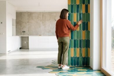
Vertical Accent Walls
A vertical tiled accent wall can make a room feel taller. This works especially well behind a bathroom vanity, inside a shower, or around a fireplace.
A narrow room can benefit from vertical lines because they guide the eye upward. Soft green, warm taupe, and blue-gray are strong choices if you want the look to feel modern but not too trendy.
Best Color Combinations for Tile Design
The right color pairing can make tile look expensive. The wrong pairing can make even good tile feel random. Here are combinations that work in real homes.
| Tile Color | Best Pairings | Good For |
|---|---|---|
| Sage green | White, oak, brass, cream | Kitchens, bathrooms, laundry rooms |
| Navy blue | White, marble, chrome, walnut | Bathrooms, backsplashes, feature walls |
| Terracotta | Cream, black, natural wood, olive | Floors, patios, rustic kitchens |
| Blush pink | White, gray, brass, burgundy | Powder rooms, vanity walls |
| Mustard yellow | White, charcoal, walnut, deep green | Small backsplashes, laundry rooms |
| Soft blue | White, sandy beige, nickel, pale wood | Bathrooms, coastal kitchens |
| Emerald green | Cream, brass, black, dark wood | Powder rooms, fireplace walls |
| Warm beige | White, brown, clay, muted green | Floors, bathrooms, open areas |
Color does not need to be loud to be interesting. A muted tile shade can add depth while still feeling timeless.
How to Choose the Right Tile Color
Choosing tile color can feel stressful because tile is more permanent than paint. The best approach is to think about the room’s light, size, purpose, and existing finishes.
Start with Natural Light
A color that looks soft in a bright showroom may look much darker in your bathroom. Always test samples in the actual room before making a final choice.
North-facing rooms often need warmer tones because the light can feel cool. South-facing rooms can usually handle deeper or cooler colors because they get more brightness.
Match the Mood of the Room
Every room has a job. A bathroom should feel clean and calming. A kitchen should feel warm and active. An entryway should feel welcoming. A laundry room can feel cheerful.
Choose tile color based on the feeling you want, not just what looks nice online.
For a calm mood, try blue, sage, warm white, sand, or pale gray.
For a cozy mood, try terracotta, clay, olive, cream, or brown.
For a bold mood, try emerald, navy, burgundy, black, or patterned tile.
For a playful mood, try yellow, mint, pink, sky blue, or mixed mosaic.
Look at Fixed Elements
Before choosing tile, look at what will stay in the room. This includes cabinets, countertops, flooring, fixtures, doors, trim, and nearby paint colors.
A beautiful tile can look wrong if it clashes with the countertop. For example, a cool blue backsplash may not work with a warm cream countertop unless there is another element tying them together.
Think About Grout Color
Grout can change the entire look of Color Tiles. Matching grout makes the tile feel smoother and more subtle. Contrasting grout makes the shape and pattern stand out.
White grout with dark tile creates a graphic look, but it may need more cleaning. Gray or beige grout is often easier to live with, especially in high-use areas.
Small Home Makeovers Using Color Tiles
You do not need a huge budget to make tile work. Small tiled areas can still create a big design moment.
Scenario 1: A Plain Bathroom Gets Personality
Imagine a small white bathroom with basic fixtures. Instead of renovating everything, the homeowner adds soft blue tiles behind the vanity and updates the mirror and lighting.
The result feels fresh, but not overdone. The tile becomes the visual center, while the rest of the room stays simple.
Scenario 2: A Boring Kitchen Feels Warmer
A kitchen with white cabinets and gray counters can feel cold. Adding terracotta backsplash tiles brings warmth and texture.
With a few wood cutting boards, warm lighting, and simple decor, the whole kitchen feels more inviting. The cabinets did not change, but the room feels different.
Scenario 3: An Entryway Becomes Memorable
A narrow entryway with plain flooring can feel forgettable. Patterned blue and cream floor tiles create a strong first impression.
Because the space is small, the pattern does not feel overwhelming. It simply gives the home a more designed feeling.
Common Mistakes to Avoid with Color Tiles
Colored tile can look amazing, but a few mistakes can make the result feel messy.
Choosing a Color Only Because It Is Trendy
Trends can inspire you, but tile should feel right for your home. If you loved green for years, green tile may be a smart choice. If you only like it because you saw it online last week, pause before committing.
Trend reports can help show what is gaining attention, but your home should still reflect your taste. Forbes’ coverage of the NKBA/KBIS 2026 kitchen trends report notes that neutrals, greens, and blues are dominant color directions in kitchens, which is useful context for homeowners choosing long-lasting palettes.
Ignoring Finish
Glossy tile reflects light and can make a small room feel brighter. Matte tile feels softer and more natural. Textured tile adds depth, but it may need more cleaning depending on where it is used.
A glossy backsplash can be practical in a kitchen. A matte bathroom floor may feel calmer and safer underfoot. The finish matters as much as the color.
Using Too Many Competing Tiles
One bold tile is usually enough. If your floor is patterned, keep the wall tile simple. If your shower wall is dramatic, choose a calmer floor.
A good design needs breathing room. The eye should know where to look.
Forgetting About the Rest of the House
Tile should not feel disconnected from nearby rooms. If your home has warm wood floors and cream walls, icy gray tile may feel too cold. If your home is modern and clean, rustic patterned tile may feel out of place unless it is balanced carefully.
Color Tiles for Different Home Styles
Every home style can use colored tile. The key is choosing the right shade, shape, and finish.
Modern Homes
Modern spaces usually look best with clean lines, large format tiles, stacked layouts, and simple color palettes.
Good choices include charcoal, soft gray-blue, ivory, clay, muted green, and matte black. Use fewer colors and let shape or texture do the work.
Farmhouse and Cottage Homes
Warm, handmade-looking tiles work well in farmhouse and cottage interiors. Try cream, sage, pale blue, terracotta, or floral-inspired patterns.
Avoid anything too glossy or overly perfect if you want a softer lived-in look.
Minimalist Homes
Minimalist spaces can still use color, but the color should feel quiet. Think warm beige, mushroom, pale olive, soft white, stone gray, or muted clay.
Texture is important here. A simple tile with slight variation can keep the room from feeling flat.
Luxury Inspired Homes
For a more upscale look, choose rich colors and refined finishes. Emerald green, deep navy, burgundy, black, warm marble-look porcelain, and glossy handmade-style tiles can all feel premium.
Pair them with quality lighting, simple fixtures, and clean edges. Luxury tile design often depends more on restraint than excess.
Practical Tips Before Installing Colored Tile
Tile is a long-term surface, so planning matters. Before installation, order samples and view them in your actual room. Look at them in morning light, afternoon light, and evening light.
Also check how the tile looks beside paint, cabinets, countertops, and flooring. A sample that looks perfect alone may shift when placed next to other materials.
For wet areas, make sure you are choosing tile suitable for that use. Wall tiles and floor tiles are not always interchangeable. Floor tiles need the right durability and slip resistance for the space.
Installation quality is also important. Straight lines, proper surface preparation, correct adhesive, and good grout work can make even affordable tile look professional. Poor installation can make expensive tile look disappointing.
Are Color Tiles a Good Long-Term Choice?
Yes, Color Tiles can be a strong long-term choice when you choose shades that fit your home and lifestyle. The safest approach is to use bolder colors in smaller areas and softer colors in larger areas.
For example, a bold patterned tile might be perfect for a powder room floor. A softer sage or cream tile may be better for a large kitchen backsplash. A rich navy shower wall can look stunning if the rest of the bathroom stays balanced.
The goal is not to avoid color. The goal is to use it with intention.
Frequently Asked Questions About Color Tiles
What color tile makes a room look bigger?
Light tile colors usually make a room feel bigger, especially warm white, cream, pale gray, soft blue, and light beige. Large format tiles can also help because fewer grout lines make the surface look more open.
Are colored tiles hard to match with decor?
Not if you choose a color that already appears somewhere in your home. Look at your wood tones, wall paint, cabinet colors, textiles, and metal finishes. Repeating one color family makes the tile feel connected.
What is the best tile color for a small bathroom?
Soft blue, sage green, warm white, pale beige, and light gray work well in small bathrooms. If you want drama, use a deep color on one wall or the floor while keeping other elements simple.
Can I mix two tile colors in one room?
Yes, but keep one tile as the main color and the other as the accent. For example, use cream tiles on most walls and green tiles inside a shower niche. This creates interest without making the room feel busy.
Do colorful tiles reduce home value?
Taste-specific tile can be risky if it is used everywhere, but well-chosen tile can make a home feel more custom and appealing. Use bold colors in contained spaces and timeless shades in larger areas.
Conclusion
Color Tiles are one of the most effective ways to add personality, texture, and lasting style to a home. They can make a kitchen warmer, a bathroom calmer, an entryway more memorable, or a living room feature wall more polished.
The best designs do not use color randomly. They connect tile color with lighting, room size, furniture, fixtures, and the feeling you want the space to have. A small backsplash, shower wall, laundry floor, or fireplace surround can completely shift the mood of a room when the color is chosen well.
Whether you love soft neutrals, rich greens, bold patterns, or warm terracotta, Color Tiles offer a practical way to refresh your home without losing function. With thoughtful planning, the right grout, and a balanced palette, they can feel stylish today and still look beautiful years from now.
Many homeowners also appreciate tile because it has a long design history, with tiles commonly used for walls and floors in materials such as ceramic, glass, stone, cork, concrete, and composites. You can read more about tile history through this tile history reference.